


Util Menu
- Home>
- Discover Kia>
- ASK>
- Does Kia have a new logo?
Does Kia have a new logo?
“Our new logo integrates 3 design concepts that also best personify our brand beliefs: “Rhythm,” “Rising,” and “Symmetry” and is available in Midnight Black and Polar White. ”
At the beginning of this year we, at Kia, recently underwent a brand transformation which came with a renovated logo and slogan, among many others. These new changes encompass our shared ambitions of becoming the leader of not just the automobile industry, but a key player in the field of future mobility.
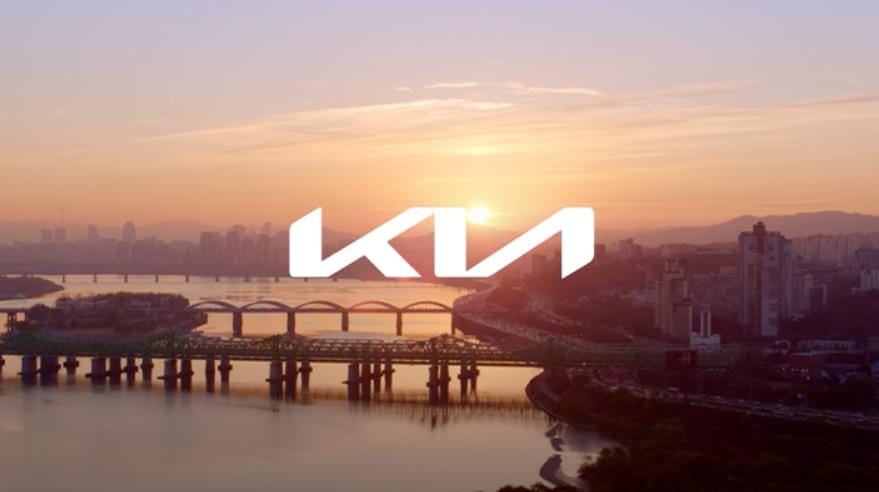
This being said, our logo is a representation of our brand adapting to the changes and development within the automobile industry, and it is a symbol of our continued promise we uphold with our clientele. This oath is of utmost importance to us, which is why our new logo was inspired and designed based on that promise. Each stroke and design feature from our new logo represents a brand value that we cherish.
- The new logo looks similar to a handwritten signature, which represents our intent to maintain our brand promise at all times.
- The lines of our new logo are rhythmic, steady, and unbroken, representing our commitment to creating moments of inspiration. While the rising lines of our logo stand for our ambitions which are continuously rising, and are driven by our passion for being a brand that holds a true customer perspective.
- Its symmetry shows the confidence we have in what we do to provide customer satisfaction.
In conclusion, the following three words, “rhythm,” “rising,” and “symmetry”, best personify our brand beliefs into our new logo.
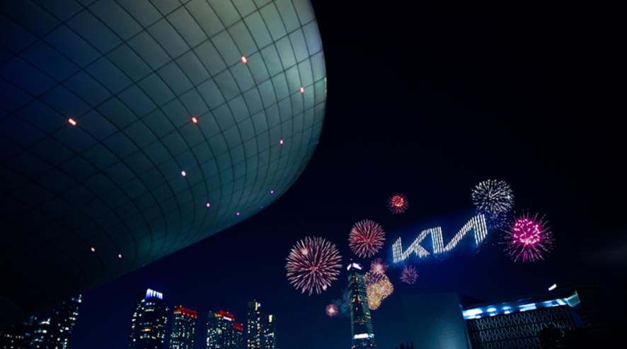
For those who are aware of our 2019 concept car, the Imagine, you may have already seen our new logo. Unlike our old logo, which comes in capital letters spelling out our brand within an oval, our new logo will still be in capital letters, but with a different style of lettering. The main focus of our new logo is the rhythmic, rising lines that are symmetrical and connected throughout to integrate the 3 design concepts: Symmetry, Rhythm, and Rising. In addition to these changes, is the shift in color. In the past, our logo was iconic red but with this movement, the standard colors will be available in Kia Midnight Black and Kia Polar White to help emphasize our stamp of approval throughout different backgrounds.
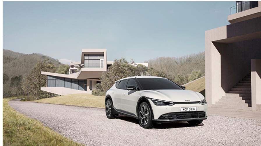
The launch of our new logo is only one of the facets of our rebranding. Alongside these changes, as we have announced in October 2020, is “Plan S.” “Plan S” is the blueprint that will guide us to advance toward creating a larger market for electric vehicles. With “Plan S” we have ambitious plans to offer 11 new EV models between the end of 2020 to 2025.
Shopping Tools
Owners
Copyright© 2021 Kia Corporation. All Rights Reserved.